Dashboard
Introduction
The Experience dashboard is the front-end tool for the PatientExperience-QDC project. It ties the back-end, the Pxtextmining, to the data source via an API and presents metrics and graphs to help clinical staff and managers gain quick insight from patient experience data and further explore the free text comments. A key focus of the dashboard is to present people with the categorisation of qualitative data.
The dashboard automates the labelling/categorization of free text data (patient experience comments) using a multilabeling approach and gives users the functionality to interact with the data, do boolean searching on the text data, compare relationships across topics, visualize trends in the data, download reports, etc.
The functionalities highlighted here are based on version 0.9 of the experiences dashboard package. Please go here to see the update of the previous versions.
The structure
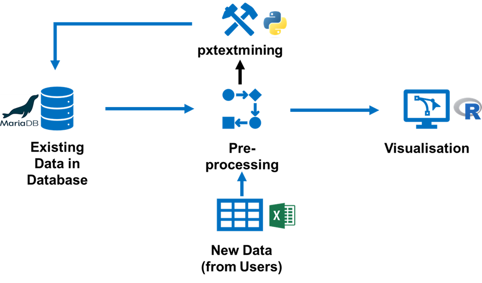
The dashboard is built using golem, an R package for building production-ready Shiny applications. The dashboard saves and loads data from a database and gives users the functionality to upload their unlabeled comment data (in several formats such as .csv or .xlsx) for labelling. The dashboard processes the feedback data and presents several insights using interactive tables, charts and other data formats for easy digestion of the data. Figure 1 below shows the schematic diagram of the dashboard’s structure. We have the source code here.
Getting started
New Trust Onboarding Process
As a new user, to begin using the dashboard, you need to reach out to the project team so they can establish your organization’s version of the dashboard. The team will assess your request, arrange a meeting to discuss your requirements and provide an onboarding email enabling you to access the dashboard.
Uploading your data
To access the dashboard contents, you need to upload your data. It is a simple process:
Go to the “data upload and management” tab
Click on the “upload new data” button
Search for the file and click “Import data”
There are a few things to note here. The data must pass the following checks:
Column names: They should follow the names used in the “general_trust_template”. The dashboard ignores columns with names other than these.
Compulsory columns: the following columns must be present in your data no matter your Trust configuration: “date”, “location_1”, “question_1”, “fft_score”.
Additional Columns: Your data must contain other columns depending on your Trust configuration agreed upon during onboarding. e.g. if you indicated you would like to filter using demographic features such as Sex, and Age, then the “sex” and “age” column must be present in your uploaded data. Likewise, if you indicated you needed to filter using the 3 clinical locations, then the “location_1”, “location_2”, and “location_3” columns must be present in your data.
File extension: The following file extensions can be used to upload data: .csv, .txt, .xls, .xlsx, .rds, .fst, .sas7bdat, .sav. However, we recommend using .xlsx (Excel format).
Date format: As much as possible, the date format should be in dd/mm/yyyy e.g. 30/09/2021, 27/10/2022.
Using the dashboard
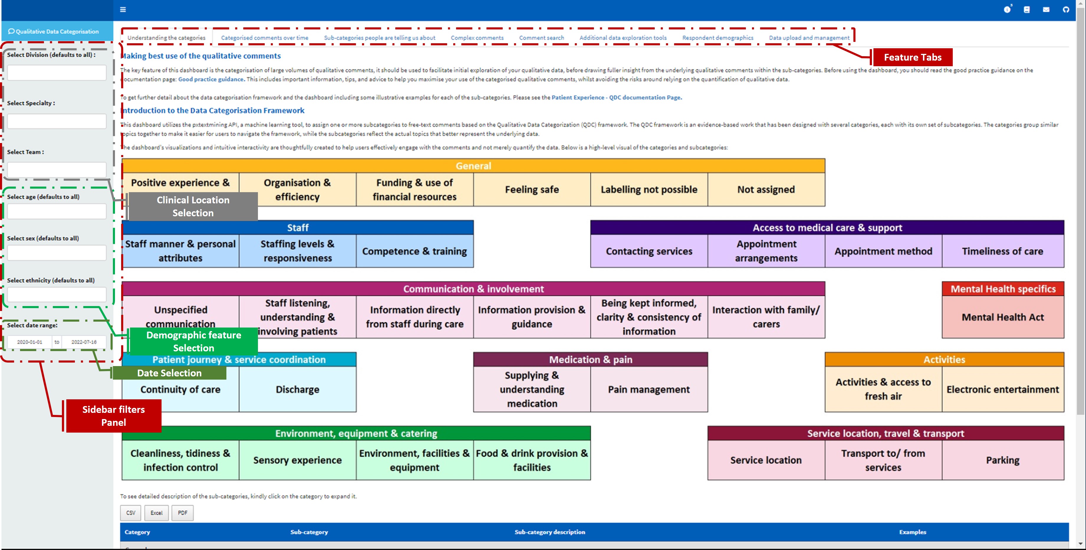
Below are the key features of the dashboard. Figure 2 below shows a screenshot of the dashboard landing page alongside all the feature tabs and the data selection options.
In this section, I will discuss the key features of the dashboard.
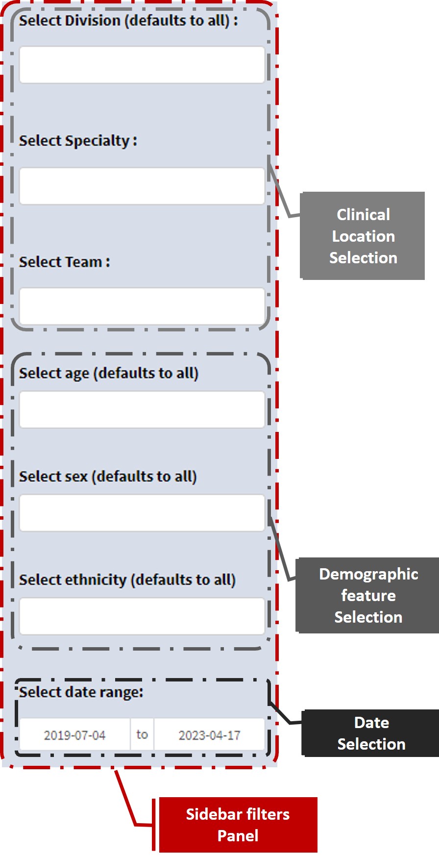
Data Selection
Tab-specific filters - affect a specific tab
Some of the feature tabs (such as the “Categorised comments over time” and “Additional data exploration tools” tab) have additional data filtering features that allow you to drill down into the data and visualise smaller samples of the data in that particular tab. These tab-specific filters don’t affect the data that is viewed in other feature tabs of the dashboard.
Feature tabs
Understanding the categories
This tab contains a brief introduction to the data categorisation framework developed as part of this project and used to assign the sub-categories to the free text comments, see the framework for more details. It also contains examples of comments that fall under each sub-category.
Categorised comments over time
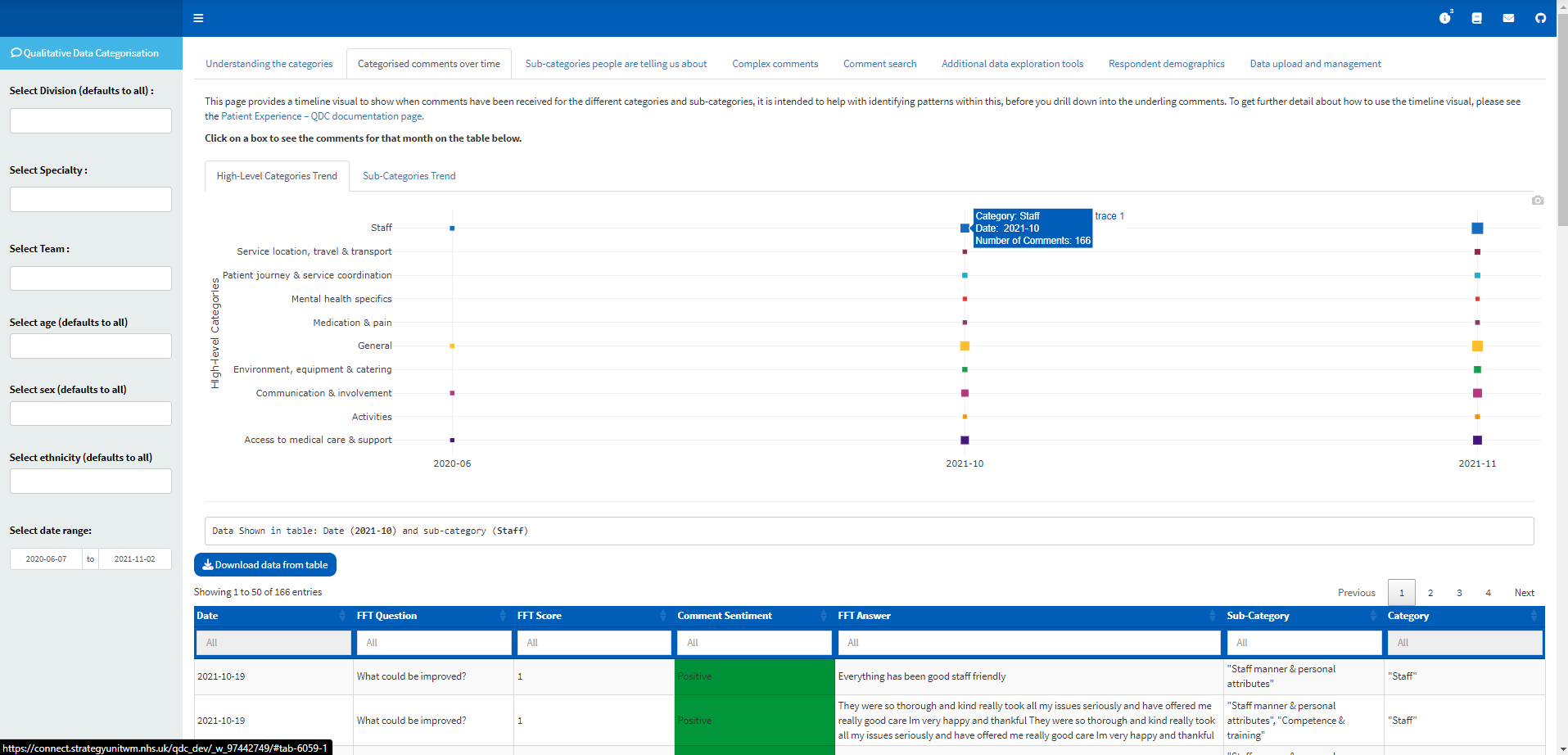
It shows a visual of the monthly distribution of comments in the sub-category/super-category levels. This visual should be used to help identify patterns in the data, particularly where there are clusters of comments around a particular sub-category.
The plot is interactive and the box increases with the volume of comments. Clicking on any of the boxes will show the underlying comments (alongside key columns such as date, FFT question type, FFT score and assigned Sentiment, sub-categories and super-categories). The comments should be read to explore explanations for any pattern seen on the visual and to carry out any additional qualitative analysis as required.
Sub-categories people are telling us about
This tab contains a few information and functionalities. These are
Number of samples in filtered Selection
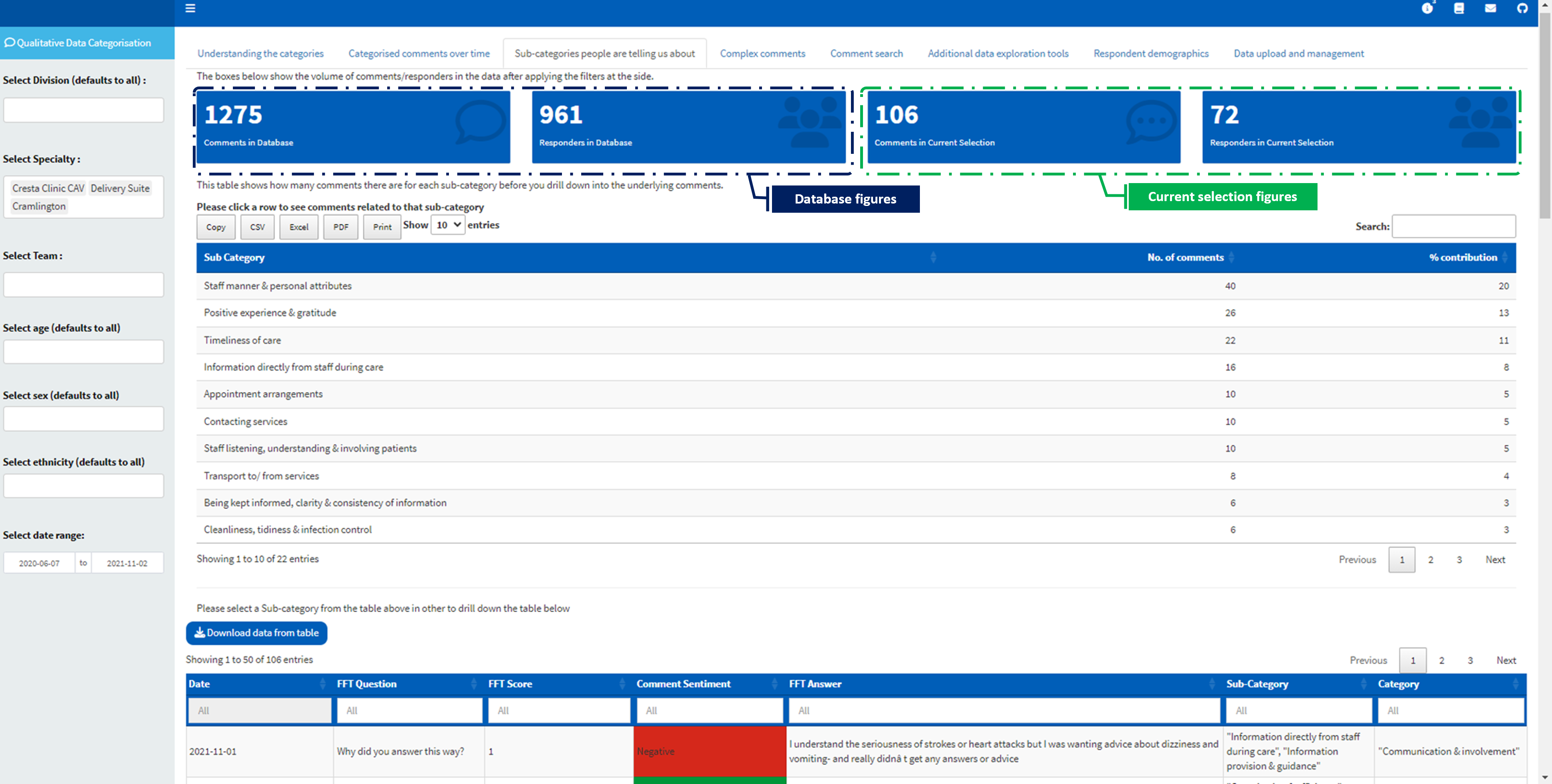
Come here to quickly see the volume of comments visualised in the dashboard. The tab shows the total number of comments/responders in the current selection (based on the filter applied from the sidebar) and the total number of comments/responders in the database (ignoring all the sidebar filters). The figure in the “current selection” represents the actual data that you are viewing in the dashboard. If you didn’t select any filter from the sidebar, then the “database” figures will be the same as those of the “current selection” figures.
Sub-category table
This shows a table of the number of comments in each sub-category. Users can select a sub-category from the table to see all the comments relating to the selection.
Complex comments
We identify that there may be situations where the machine learning model might be wrong in the sub-categories assigned to comments, and this may be especially true for very long comments. We set some criteria to catch those complex comments for further interrogation. Below are the simple criteria used to flag a comment as a complex comment (if any are met):
The comment has over 50 words
The comment has over 5 labels attached
Users can view and download the data containing complex comments from this section of the dashboard.
Additional data exploration tools
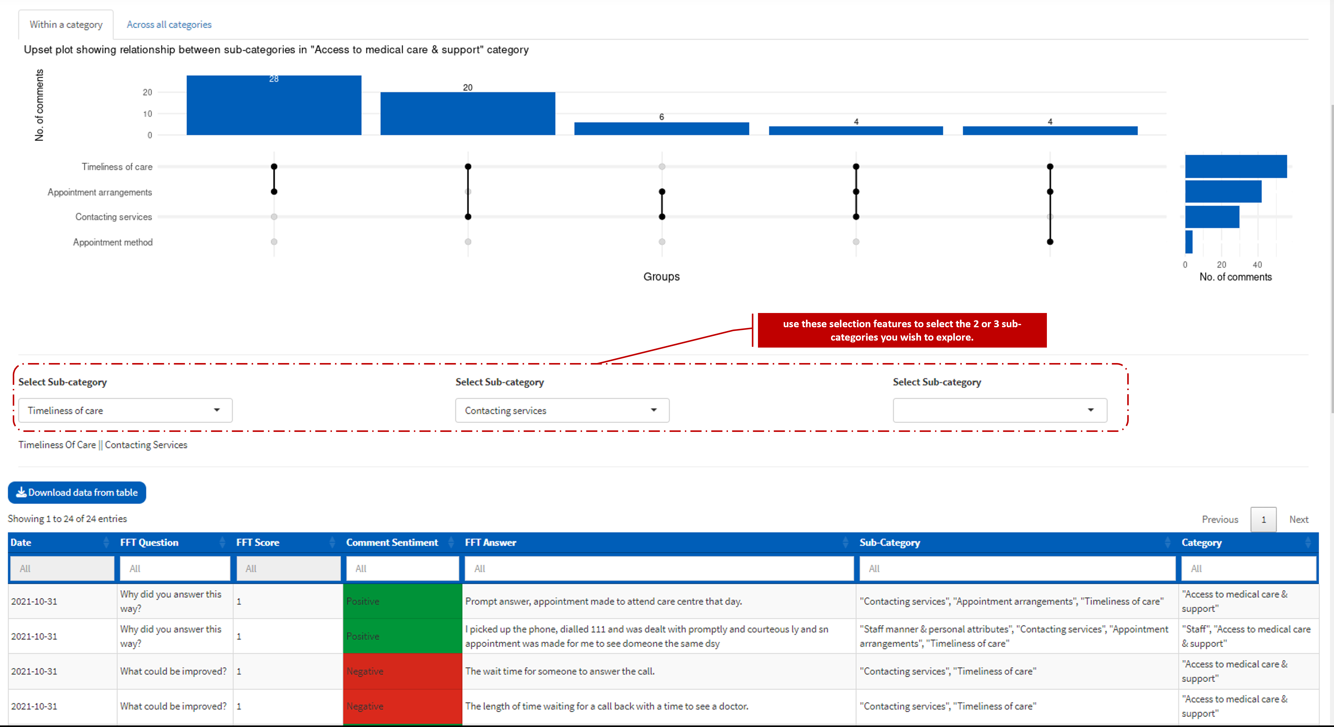
This shows an upset plot, which is a type of visualisation for analysing data with a large set (in our case sub-categories). The plot allows users to see the number of comments in the sub-categories association, i.e., you can see the sub-categories that occur together more/less often based on the number of comments they have in common. Users can’t interact with this plot but they have the option to scroll down and select two or three sub-categories to see the underlying comments they have in common.
There are two sub-tabs in this tab that allow you to view the relationship within a category (e.g. staff) or across all the categories. The column bar on the plot shows the total number of comments in each relationship. A selection feature is provided to set the minimum number of comments a relationship needs to have in other to show on the pot.
The plot is not currently interactive, you need to use the selection features below the plot to select the 2 or 3 sub-categories you wish to explore.
The visual should be used to identify sub-categories with relationship and the sub-category selection functionalities should be used to see the underlined comment and investigate the pattern. Please see our post on using an upset plot to explore the relationship between large categorical data to understand more about upset plots.
There is a known issue with the inter-relationship plots not fitting the screen for users on a small screen. Here is a quick fix:
a. Please access your browser setting (three dots (…) at the top right of your browser)
b. Zoom out to 75% or 80%
Respondent demographics
Two types of charts are shown here for each demographic variable
- Distribution of the demographics in the sample.
- The percentage of the mean FFT score for each group in the demographic feature. Where a Mean score of 1 is 100% and 5 is 0%.
Data upload and management section
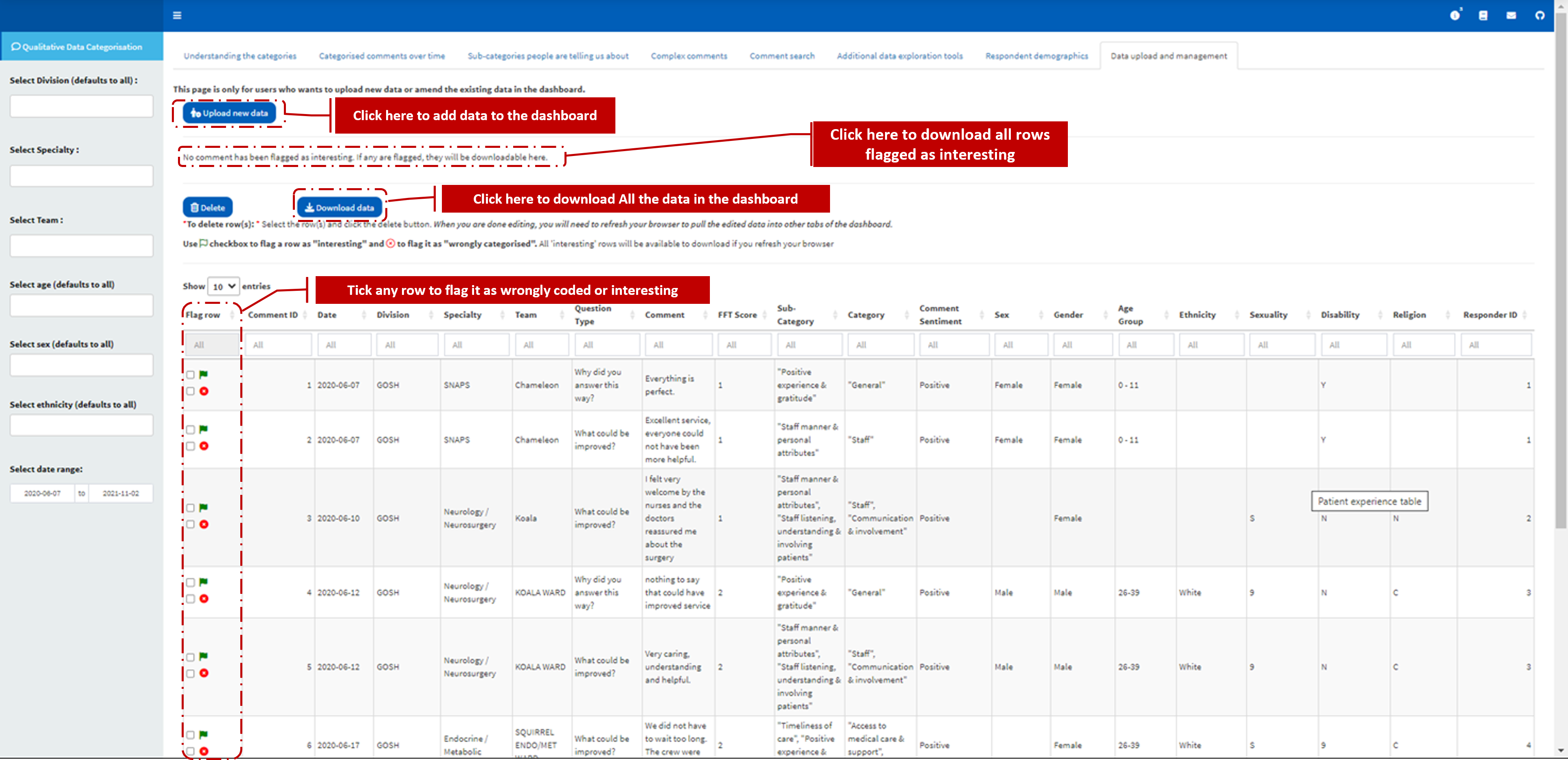
This tab will only be visible to those specific users within your organisation who have the right to upload new data or amend the existing data in the dashboard.
In this tab, users have the functionality to
Assign label to new data: Users can upload their data and once this data is uploaded the pxtextmining API is called to assign sub-categories to the free comments and the data is saved in the database. Users can then refresh their browsers to assess the newly uploaded data alongside their existing data.
Manage Data: Users can delete rows within their data right from the dashboard environment.
Download historical data: Users can download the whole underline data currently loaded into the dashboard.
Flag comments as wrongly coded or as interesting: Users familiar with the comments data can flag wrongly labelled comments (or those which should be assigned additional labels) by checking the box. Also, they can flag comments as interesting (for later download) by checking the box of the comment.
Download flagged comments data: If any comments are flagged as “interesting”, they will be available for download from this tab.
What Next?
We kindly ask for feedback from the dashboard users. How have you utilized the dashboard? What benefits have you gained from using it? Are there any changes or adjustments that you would recommend? Moreover, we would like to know what new features you would like to see added. Your input is significant to us in making the dashboard more effective and useful.
Please contact us by emailing chris.beeley1@nhs.net.
Comment Search
Users can make a Boolean search for comments with specific keyword(s). The result of the search can be downloaded. The keywords used in the search are used as the filename when saving the data.