Using an upset plot to explore the relationship between large categorical data
Introduction
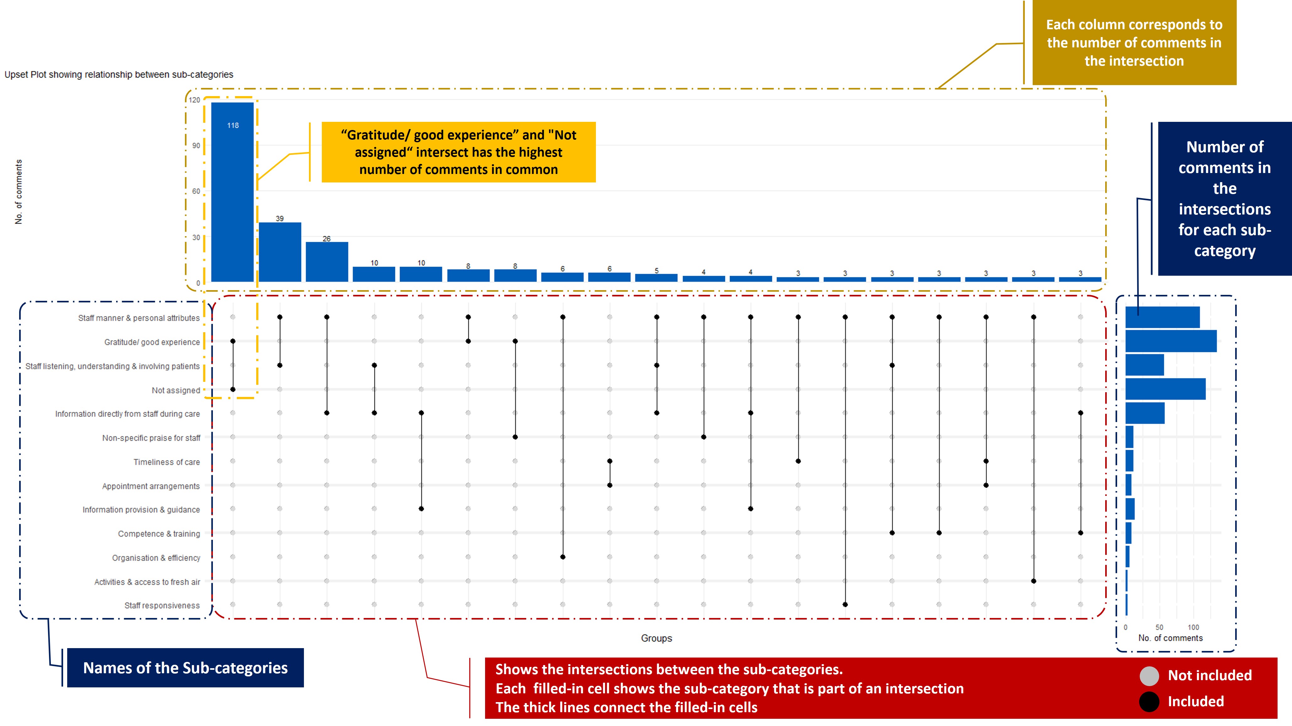
An upset plot is a great visualisation tool that can be used to show and understand the relationships and associations between large categories (called sets) in data. It shows the number of elements (number of comments in our case) the set (sub-categories) have in common and visualise it nicely using a matrix layout and a series of bar charts. The matrix layout enables the effective representation of associated data, such as the number of elements in the aggregates and intersections.
How is it plotted?
To plot an upset plot the data has to be prepared. Using our use case as an example, we prepared the data in this way:
Every record (row) represents one comment
Each column represents a label with a yes/no flag as to whether or not that comment was assigned the label. It is coded 1 for “yes” and 0 for “no”,
All the label names are used as the attribute on the plot.
Why Upset plot and how should it be used?
In this project, we assign labels (sub-categories) to free text comments in a way that one comment can have 1 or more labels assigned to it. Upset plots provide a way to show the relationship between the assigned labels simultaneously. By exploring this pattern we can identify groups of categories that are mostly discussed together in a single comment. This plot can guide us as we explore answers to questions such as this:
Do most comments about staff “competence & training” also relate to the “provision of medical equipment”?
This plot is used in the dashboard as a visual guide to help users as they explore the free text comments. The plot can be used to gain insight into the sub-categories that people might talk about more frequently within the same comments. However, the fact that people talk about a group of sub-categories in the same comment doesn’t mean those sub-categories have a relationship in reality, and that is why we provide functionality within the dashboard for users to further explore the free text comments. The comments should be read to explore explanations for any pattern seen on the visual and to carry out any additional qualitative analysis as required.

